Starwest
Consumer Products
Strategy // Messaging // Visual Identity Refresh // Packaging // Art Direction
THE ASK
This heritage herbs and spices brand came to us in need of a modern platform, visual identity, and expression, as well as a brand voice, to fuel connection and growth in DTC while retaining its legacy wholesale business.
THE INSIGHT
Modern consumers crave holistic solutions to support health and well-being from safe, reputable sources, but lack access and knowledge in the space to make confident buying decisions quickly.
THE SOLVE
Infuse Starwest’s rock-solid reputation as a trusted source of premium products with an inspiring and modern new identity that empowers consumers to engage with the brand, mind, body, and soul.
THE OUTCOME
Unearthing the wonders of nature to inspire every body. Our brand work extended into packaging, photo styling and shoot direction, giving the brand the building blocks to launch a fresh new e-commerce experience.

STRATEGY
In an industry as impactful as health and well-being, understanding the personal journeys of our customers was crucial to building a brand they could trust.
-
Interviews with internal stakeholders revealed core truths critical to making natural wellness accessible to a wider audience. Further research guided us in shaping this vision into a reality.
-
We developed a series of persona archetypes to help focus the efforts of the brand team. Understanding purchase drivers, barriers, and goals of their target audiences will help align Starwest as a trusted advisor and friend.
-
We developed a functional brand platform that set up core concepts and created a roadmap for internal teams to guide a wide-range of daily decision making including product development, marketing and communication, sales, merchandising and more.
BRAND PERSONALITY
Starwest Botanicals is the trusted friend that accepts us for who we are while inspiring us to be all we can be.


Starwest Botanicals helps conscientious consumers unearth the powerful benefits of botanicals to transform daily life.
THE STARWEST PERSONAS
Everyone approaches conscious living in a way that is unique to them.
Starwest Botanicals is passionate about unearthing the wonders of nature to inspire every body, meeting them wherever they are on their journey to enrich their body, mind, or soul.


OUR CUSTOMERS
We developed a set of robust customer personas to guide the brand in forging strong connections with new consumers based on their wants and needs.
CULINARIANS
“I want to explore, taste and experience what the world has to offer and share that with my friends and family back home.”


VISUAL IDENTITY
With thousands of products in their catalog, Starwest needed a dynamic visual identity system that supported a wide array of needs while rooting them to their new brand platform.
-
The logo mark was modernized to meet the new long-term vision of the business. The typeface honored the past while looking to the future, integrating the year established to signal the brand’s commitment, longevity, and integrity.
-
Our team embraced the colors naturally derived from ingredients in the brand’s products. The resulting visual identity system created a richer, deeper connection with the brand’s mission to make botanicals feel accessible.
-
We established a clear typography system to guide execution across primary, secondary, and tertiary typesetting needs. This system supports the brand across packaging, print, and digital touchpoints.
-
Guidelines were codified to align internal teams with the new brand expression and assets, ensuring clarity and consistency across all touch points.
-
We directed and produced a lifestyle and product photoshoot in support of packaging, marketing, and website design.

Original Mark
Refreshed | Structured | Approachable
Honoring the past through type and the founding date conveyed credibility and heritage while modernizing the mark with timeless elegance.

Logo Exploration

Final Logo
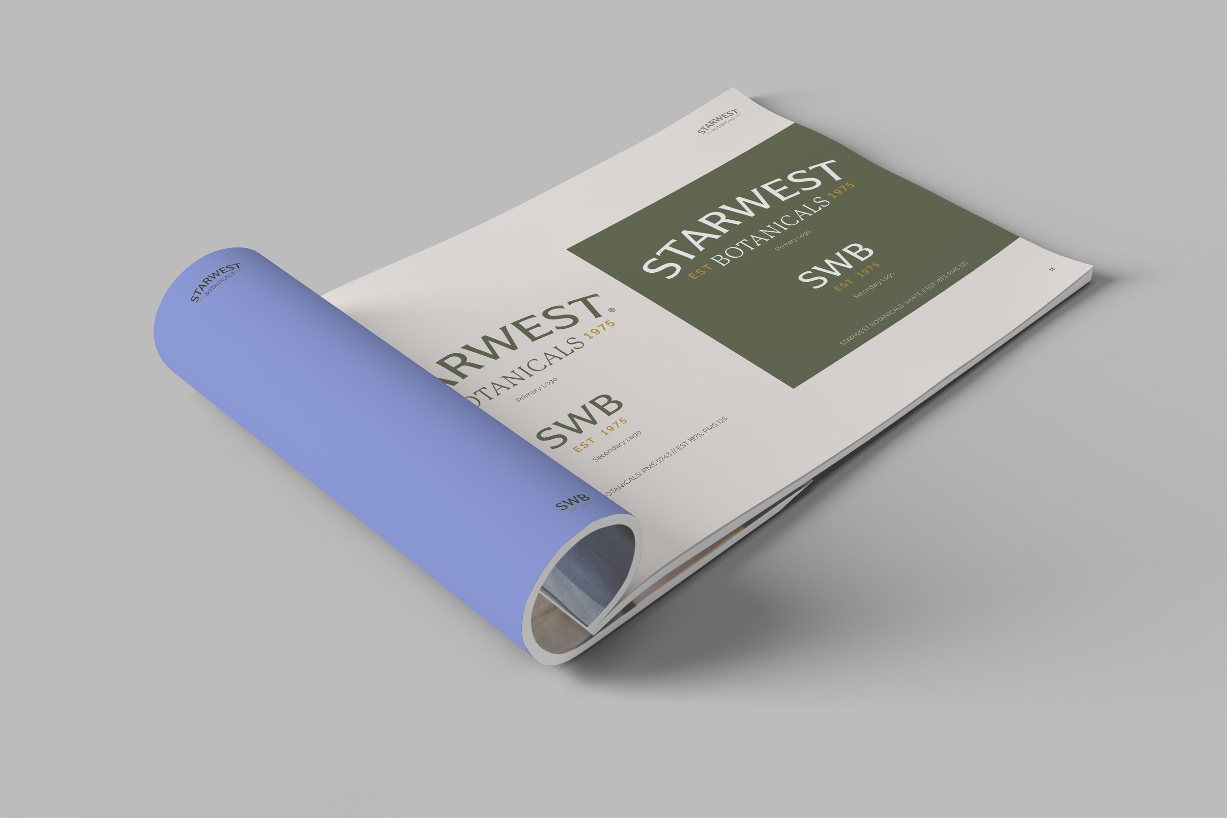
Brand Book


PHOTO STYLING AND ART DIRECTION


PACKAGING REDESIGN
The redesigned packaging system featured the refreshed brand identity as well as new product photography, and integrated QR code technology to support a seamless shopping experience. Along the way we streamlined label variations - resulting in cost reductions.


Don’t take our word for it.
Let us connect you to our client partners to learn more about our journey together.
“Clever successfully connected the heritage of our brand to where we are headed and what consumers crave in the naturals space.”
— Amy McDonald
Chief Executive Officer


